|
|
Post by fauxmaha on Nov 11, 2015 14:11:28 GMT -5
|
|
|
|
Post by Fingerplucked on Nov 11, 2015 14:14:48 GMT -5
I win!!!
Being first has its advantages.
|
|
|
|
Post by Village Idiot on Nov 11, 2015 14:31:08 GMT -5
I voted for #2. Very cool 3-D thing going on.
|
|
|
|
Post by billhammond on Nov 11, 2015 14:32:58 GMT -5
I think 1 is the cleanest.
Hey, Jeff, looks like that storm is upon Omaha, how bad is it?
|
|
|
|
Post by majorminor on Nov 11, 2015 15:02:23 GMT -5
I voted #1, but would recommend you maybe rework the graphic a little to be a subliminal man with an erection. Oh wait, I see you've done that already.
|
|
|
|
Post by RickW on Nov 11, 2015 15:06:14 GMT -5
I actually liked number 1 the best from looks, but I'm not sure what the symbol has to do with your company, and I it looks like other things, like Yamaha's tuning fork logo, that might be confusing. So I went with number three, which is very clean, simply, understandable.
On review, I guess the symbol is an SB, but that is not terribly apparent at first glance, and will be even less so when it's not beside the others.
|
|
|
|
Post by david on Nov 11, 2015 15:30:26 GMT -5
I liked the look of 1 best but the "B" in the emblem, if that is intended, does not look "B" enough. I therefore went with 3.
|
|
|
|
Post by TKennedy on Nov 11, 2015 15:35:42 GMT -5
#1 for me.
|
|
|
|
Post by fauxmaha on Nov 11, 2015 15:42:14 GMT -5
I think 1 is the cleanest. Hey, Jeff, looks like that storm is upon Omaha, how bad is it? Weird thing just happened. I just got back from running an errand. While I was out, a tornado warning for Pottawatomie County (the county in Iowa directly east of here) came over the radio...and then literally two or three minutes later they came back on and cancelled it. How weird is that? Anyway, kind of cold, light rain, a little thunder earlier. Other than the phantom tornado warning, just another day. |
|
|
|
Post by Marshall on Nov 11, 2015 15:44:31 GMT -5
I like the text on 1, but not the logo.
The 3D logo on 2 is nice, but dated.
The logo on 3 is simple but direct.
So I'm not voting in the poll. I'd choose 1 text and 3 logo.
|
|
|
|
Post by factorychef on Nov 11, 2015 16:06:55 GMT -5
1
|
|
|
|
Post by Bassman on Nov 11, 2015 16:18:33 GMT -5
I'm Liking 1
|
|
|
|
Post by fauxmaha on Nov 11, 2015 16:23:59 GMT -5
I like the text on 1, but not the logo. The 3D logo on 2 is nice, but dated. The logo on 3 is simple but direct. On FB, AJ described #3 as "1975". Thoughts? |
|
|
|
Post by Fingerplucked on Nov 11, 2015 16:37:00 GMT -5
I like the text on 1, but not the logo. The 3D logo on 2 is nice, but dated. The logo on 3 is simple but direct. On FB, AJ described #3 as "1975". Thoughts? Yeah. He's too young to know 1975. |
|
|
|
Post by epaul on Nov 11, 2015 16:38:27 GMT -5
Binders are 1975. 1975 was good. 1975 was golden.
|
|
|
|
Post by epaul on Nov 11, 2015 16:48:00 GMT -5
I vote #3. It was the only one I would consider using.
1 ? What is that thing? Less than 5% of your potential clients will see an "S" and a "B". It looks like some kind of goofy cross or a bird's foot or messed up peace sign. By the time they, if ever, see a "S" and a "B", too many potential customers will think, "What and Why the hell is that thing? What's up with all this goofy cutsie shit, I'm sick of this graphic design gone amok crap, all I'm looking for is a goddamn binder, not some fancy pants metrosex aren't we special puzzle thing."
#2 ? What is that thing? At first I thought it was a kid's play block, or a graduation cap, or a distracting something.
Go with #3.
#1 and #2 are too cutsie and confusing. Get to the point, a clear S and B leading to Speedbinder. Save the fancy graphic crap for some fancy Euro thing, like a line of asexual designer clothing or a logo for a $900 purse, don't dump it on an Honest to God American Binder Company from the Heart of Nebraska. We binder customers want to see simple honesty, not some androgynous new age graphic twiddle twaddle.
|
|
|
|
Post by billhammond on Nov 11, 2015 16:49:17 GMT -5
1975 was good. 1975 was golden. 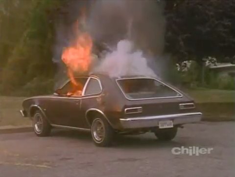 |
|
|
|
Post by Fingerplucked on Nov 11, 2015 16:52:33 GMT -5
1975 was good. 1975 was golden. I had one of those but I never tried barbecuing in it. I did put up a sign that blocked most of the rear window saying something like DON'T HIT ME UNLESS YOU WANT TO BLOW UP WITH ME. |
|
|
|
Post by Marshall on Nov 11, 2015 17:14:25 GMT -5
I like the text on 1, but not the logo. The 3D logo on 2 is nice, but dated. The logo on 3 is simple but direct. On FB, AJ described #3 as "1975". Thoughts? When I looked at it I saw a simple sb. I didn't see the single squiggle line making an "s" & a "b." Yeah, I suppose that's sorta 70s. But it's clear and simple. Maybe you want to look like you've been around since the 70s. (  ). [or change the letters to be a font and not a squiggle] |
|
|
|
Post by aquaduct on Nov 11, 2015 17:36:41 GMT -5
#2 is kind of a direct rip off of the Green Bay packaging logo.
Just sayin'.
|
|


 ). [or change the letters to be a font and not a squiggle]